Chapter 2
Models of Growth: Rates of Change
2.6 Logarithms and Representation of Data
2.6.2 Logarithmic Plots of Data: Base 10
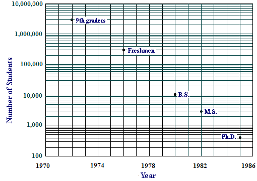
Your plots in Activity 2 and Activity 3, which serve their intended purpose, have a distinct disadvantage as pictures of data: You can't look at these pictures and read off populations at particular dates. Contrast this with Figure 3, which is also a picture of approximately exponential data - as we shall see - and the population figures can at least be estimated from the graph. This graph tracks a single cohort of students, ninth graders in 1972, through the years those students would have been in college and graduate school, counting those who eventually got degrees in the mathematical sciences.
![]() Note 1 – Source
Note 1 – Source
The secret of the graph in Figure 3 is its vertical scale. The numbers on that scale increase exponentially rather than linearly - each is \(10\) times the one below it. But those numbers, \(10^2 \), \(10^3\), \(10^4\), \(10^5 \), \(10^6 \), and \(10^7 \), are arranged on a linear scale, so the effect of graphing against that scale is to undo exponentiation, i.e., to graphically take a logarithm - with base \(10\). This kind of graphing is called semilog plotting. You can find free, print-it-yourself, semilog graph paper on line (e.g., at customgraph.com), but, of course, it is much easier if your computer or calculator will do semilog plotting for you. We will provide a tool to do this in Activity 5.
Activity 5
Use the plotting tools to compare semilog plots and natural log plots of the data in Cases 1 and 2. (The data for these cases are already entered in the online interactions.)
Semilog plotting of data has the effect of taking log10 (also called common logarithm) of each value of the dependent variable. Notice that the semilog plot for Case Study 1 is straight and the semilog plot for Case Study 2 is not. That's the same result we got by taking natural logarithms.
![]() Note 2 – Terminology
Note 2 – Terminology
Recall that the data points in Figure 3 track a single cohort of students, ninth graders in 1972, through the years those students would have been in college and graduate school, counting those who eventually got degrees in the mathematical sciences. The relationship on the semilog graph is nearly linear. Thus, if \(P\) represents the population in the math pipeline, then
where in the starting year (1972), and is the population in that year.
-
Estimate the slope \(k\) of the linear function giving in Figure 3: Choose your own run, and calculate the corresponding rise.
Solve the equation for \(P\) to express \(P\) as an exponential function (what base?).
-
By what factor does \(P\) change in one year's time? Explain the following statement from Everybody Counts: "[O]n average, we lose half the students from mathematics each year."


